Upgrade typography
A workhorse sans, with character
Upgrade marks TYPETR’s first “normal” typeface release in many years. This substantial sans serif family supports a generous set of characters and features, and will thrive in a wide range of publication types and media. The typeface lends itself particularly well to scripted workflows.
Acknowledgements
As always, designing a large family like this—writing a novel—never happens without the support and input from a great team. I’d like to thank (in order of appearance) Claudia Mens, Tilmann Hielscher, Jill Pichotta, CJ Dunn, David Jonathan Ross, Marina Chaccur, Tamye Riggs, Yves Peters, Claire Lindsey, Kirsten Langmuur, Caren Litherland, Chris Lewis, Paley Dreier, and the rest of the Type Network production and marketing teams.
I’d also like to thank the suppliers of tools: Frederik Berlaen, Tal Leming, Erik van Blokland, Just van Rossum, Alexandre Saumier Demers, and Michiel Kauw-A-Tjoe.
Last but not least, thanks to my partners in Type Network (and more): David Berlow, Sam Berlow, and Roger Black.
Thanks to all for the creation of context, valuable input, support, and resources.
—Petr van Blokland
This site
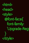
This website gives an overview of what TYPETR Upgrade is capable of, and provides background information about its design and production. The site itself demonstrates what can be done with TYPETR Upgrade.
Furthermore, the site contains a variety of example publications, most of which can be viewed in detailed PDF form by clicking on the thumbnails.

Wide range of weights
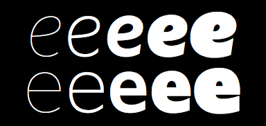
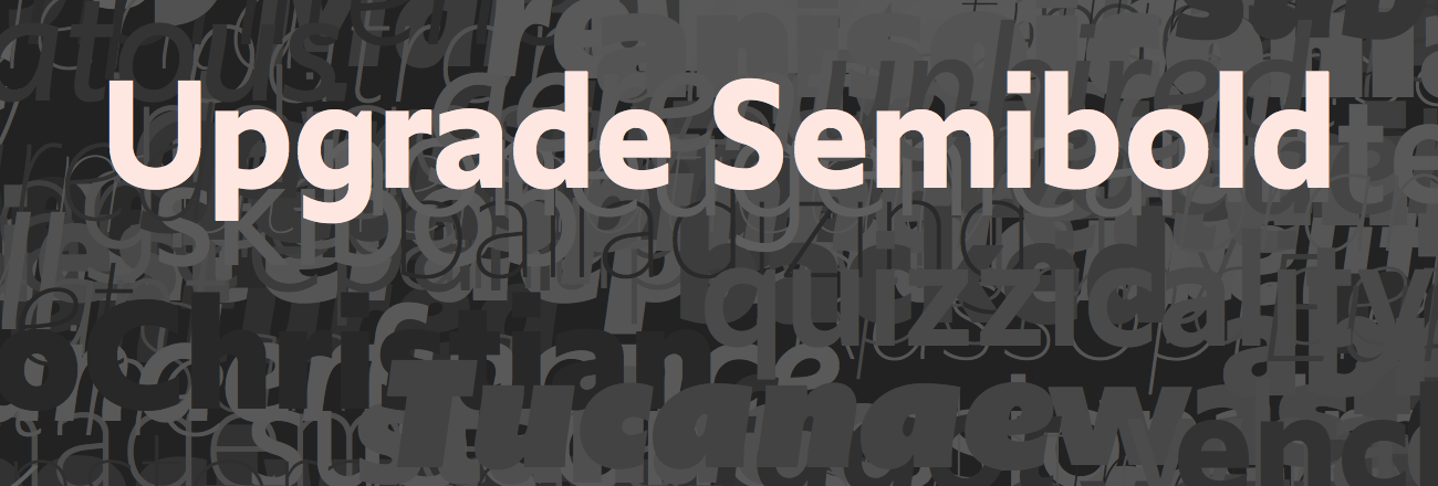
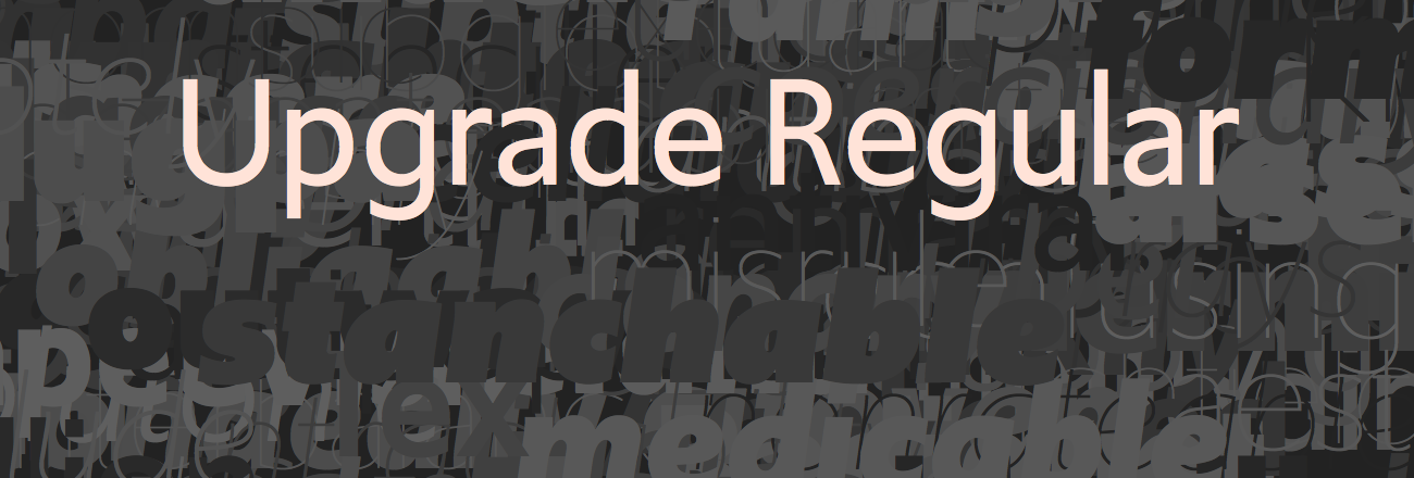
Because Upgrade is destined for complex, heavy-duty typography, an extremely broad range of weights is available, from Hairline to Ultra Black. Read more

Extended glyph set
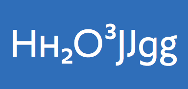
Upgrade includes an extended glyph set supported by a number of stylistic feature options, such as small caps, inferior and superior figures, an inline capital J, and an alternate g. Read more

Five master drawings per character
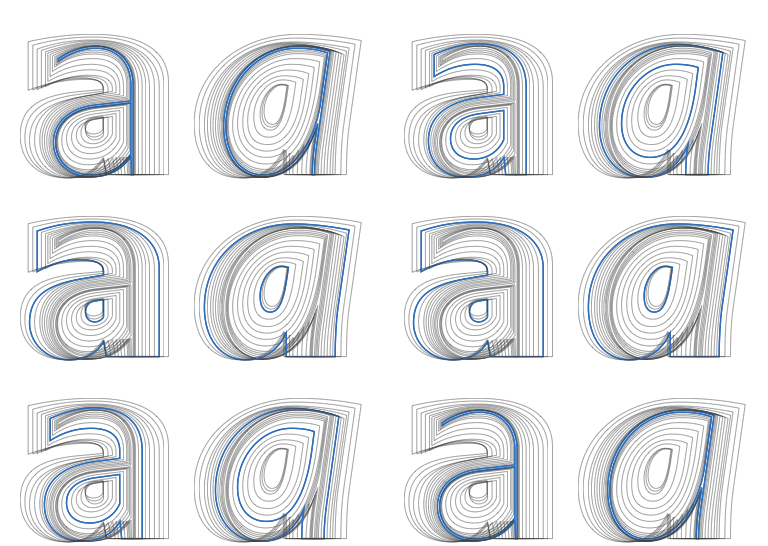
Different weights of a typeface are often made by interpolating two or three master drawings per character. Upgrade is made from five original drawings. Read more

Figures and fractions
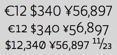
Upgrade offers a variety of figures and supporting currency symbols for use with capitals, small caps, lowercase characters, and fractions. Read more
Most examples on this site have been generated by scripts. Not all designers will find that interesting, but TYPETR believes that typeface and publication development have radically changed over the past few years. The increase in size (800+ glyphs, 8000+ kerning pairs, interpolating weights and widths), the construction of the new variable fonts, and the creation of documents by parameters and data—rather than by manual page layout—call for new perspectives on typography and graphic design.
A workhorse for web and print

Upgrade variations for a myriad of uses
The wide variety of weights, combined with additional styles to be released in the near future (e.g., Upgrade Text, Upgrade Round, and Upgrade Var), makes the Upgrade family a perfect choice for corporate communications—from branding to annual reports to large enterprise sites. Learn more

Design Design Space
The Design Design Space website uses web versions of several Upgrade weights. This study and coaching environment offers designers and design students an online setting to develop their design process. Learn more

Book covers
For use on book covers, a nice range of very thin weights is available. Learn more

Apps and forms
With open apertures and a generous x-height, Upgrade performs well in low-resolution environments. Learn more

Long-form typography
The figure sets and variety of weights make the Upgrade family a viable tool for complex long-form typography. Learn more

Corporate identities
Future releases of Upgrade will include variants that can be used for logos and other identity elements. Learn more
It is beyond the scope of this website to discuss all of this in detail. And it is equally possible to purchase a single license of Upgrade.
And yet, TYPETR thinks it relevant to mention that much of Upgrade’s functionality lends the typeface to scripted types of publications, such as online and automated PDF documents.
Within the stimulating, supportive context of Design Design Space, designers can study the development of their approach using scripting and other prototyping and production techniques. TYPETR Upgrade is an excellent example of how automation can address a typeface’s functionality more readily than manual processes. Scripts for the images on this website are available to designers who purchase an Upgrade license. Conversely, designers who take a course or workshop at Design Design Space will receive special free Upgrade styles.
Throughout this website, you will find examples of relevant studies and workshops that support the use of Upgrade in scripted publications. With the near-future release of Upgrade Var (a ten-axis variable font), this development will become even more important.

Thought challenge
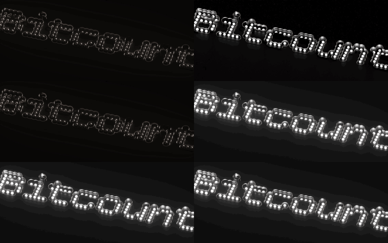
What would a fusion of TYPETR Upgrade and TYPETR Bitcount look like? Stay tuned for more info soon. In the meantime, you can play with Bitcount at Type Network.
Bitcount 3D image renders by Mohamed Amine Belcaid.
In line with the new variable-font technology, Upgrade Var is under development with parametric interpolation axes XTRA, XOPQ, RNDS, GRAD, YTLC, YTUC, YTDE, and registered axes wght and wdth.
This new technology combines all Upgrade weights (and more) in a single font file, so all intermediate weights and widths can be selected, too. The practical aspect of this is that headlines can be made to fit a defined width and a given point size.
Perhaps this all sounds too technical for you. Worry not—you can expect to see more visual support here soon.
Read Type Network’s specification for parametric axes in variable fonts.
