TYPETR Upgrade

  • Buy
  • Glyphs
  • Features
  • Styles and axes
  • Usage
  • Making

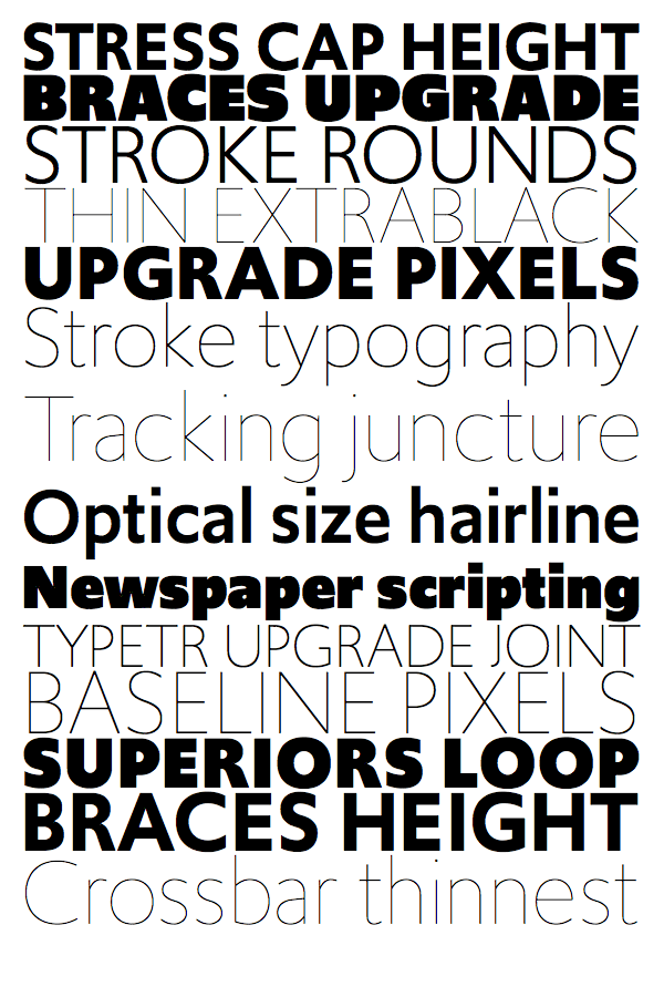
Upgrade styles and axes

Supporting a variety of related styles
NoordzijCube-test-x-1000MMTranspUpgrade.gif

Gerrit Noordzij’s cube is based on a merger of expansion contrast (sharp-nib pencil) and translation contrast (broad-nib pencil). The type of contrast used in Upgrade is based on translation, with little difference between vertical thick and horizontal thin strokes. The animation (based on software by Just van Rossum’s Daily Drawbot) shows where the contrast principle of Upgrade is located in Noordzij’s cube.

Upgrade styles shown in this example are Light, Book, Regular, Semibold, and Black.

Different drawings for different weights

glyphsbyweights.png

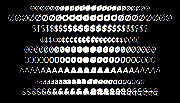
Depending on the available space of stems and counters in the various weights, some characters have different drawings. There is no room for the vertical bar in the dollar and cent symbols to strike completely through. Note that although all weights are shown here (ranging from Hairline to UltraBlack), details in the extreme weights may not make them ideal candidates for use in this size.

More variations to come in the near future

More variations in the Upgrade family—like Upgrade Condensed, Upgrade Wide, and Upgrade Text—will be released soon. And these variants will be combined, together with other parametric axes, in Upgrade Var. These are all intended to increase typographic quality for specific usage and size.

Alternative styles, using the Upgrade family as a template

Also planned are variants that cannot easily be expressed in the interpolating axes needed for variable fonts. These variants have a more stylistic approach based on specific usage, where readability is not the first priority. Some projected example names of these non-variable families include Upgrade Round, Upgrade Notouch, Upgrade Logo, Upgrade Ink, and Upgrade Metal.

Axis examples

  • Weight (wght)

    The default weight axis of Upgrade is made from five masters, to cover the extreme range between Upgrade Hairline and Upgrade UltraBlack. Click on the animation to view a similar document as a PDF.

  • How this animation was made

    This eight-frame animated GIF was made by this PageBot script, which works as follows:

    [1] Start a script in DrawBot + PageBot that takes a random selection from a list of words and then combines them in pairs. Each pair will fill a line.
    [2] If the number of characters in a line is fewer than twelve—or otherwise with a chance of ten percent—convert the line to capitals.
    [3] The stack of lines starts at the top of a page: put the cursor at the top left corner of the margin.
    [4] Select a random weight from the TYPETR Upgrade family. There is a twenty percent chance that italics are selected.
    [5] Then calculate the point size needed, to make the line fit the document page width.
    [6] Calculate the enclosing pixel box and move the cursor position vertical to the next line, increased by some leading.
    [7] Repeat this until the page is filled.
    [8] Then repeat this page sequence for the required number of frames in the animation.
    [9] Save as a PDF and as an animated GIF, with a frame duration of three seconds.

  • Baseline J [ss08] feature

    Note that the capital lines use the OT-feature [ss08], which forces Upgrade to use the inline J instead of the standard hanging J. This creates a closely wrapped bounding box on capital words.

Design workshops

  • Are you looking for a course to improve your type-design skills? Or simply one to learn how to script boring production tasks? That is possible. See for instance:

  • Python scripting for type designers (4 weeks, February 5 - March 5, Online, 6 spaces left)

    During this 4 week course, type designers learn from scratch how to script micro and macro tasks, during their type design process. In a series of short specific assignments, if possible, closely related to their daily tasks, the designers learn to recognize design patterns that can be automated, breaking them down into existing functions and ones that need to be developed. Read more...

  • Python scripting for type designers (3 days, February 5 - March 5, Online, 6 spaces left)

    Right after Roboton, as a condensed version of the 4-week (February 5 - March 5) “Scripting for type designers” study, these 3 days will address the highlights in order to set type designers in the right direction of thinking. The intent is to give designers an overview of their potential toolset and paths to develop themselves further in their design practice. Upon request, special emphasis can be put on the development of scripting for Variable Font design and proofing. Read more...

  • Generally speaking, Design Design Space encourages students to study the design of their process, independent of context, domain, or purpose of the designs.

Learn more
Copyright © TYPETR | Buro Petr van Blokland + Claudia Mens, Inc. All rights reserved.